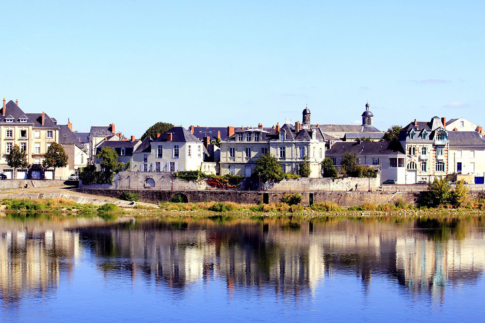
Click to enlarge - copyright Susan Moss
Print Critique #7 by Susan Moss Hi This month we have a great image to critique from Susan Moss in Perth WA, here is what Susan had to say about her image. I took this image in the Loire Valley last year, and love the colours and reflections. I cropped it a bit, but not much and have done some tweaking in PS Elements Tech Data
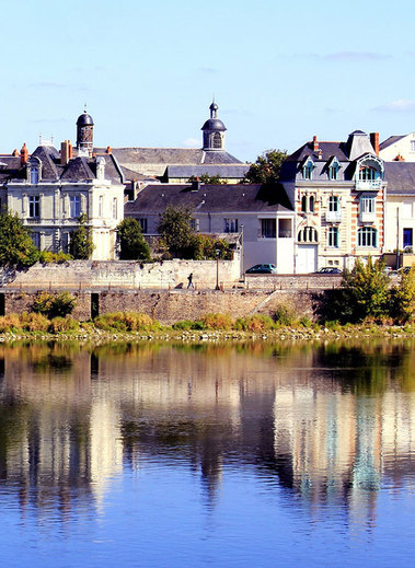
Technical The first technical choice that I make when looking at a potential image I am about to make is always the Aperture, this governs the depth of field and will dictate our shutter speed after we have selected an ISO. With this image we are focused on infinity and really the closest point of focus in the image is quite a distance so we don't have to have an aperture that gives us a massive depth of field. In these cases I always stay around f5.6 to f8. The advantage with f8 over f18 is that our lens is sharper at f8 due to less diffraction. The difference is not huge but every little bit counts. Susan's shutter speed is 1/60 second which is OK, if it was taken hand held then this is the limit for that focal length. If you are not sure what is an acceptable speed to hand hold then the rule of thumb is 1/ the focal length. So with the lens zoomed at 55mm, we need a min shutter speed of 1/55 th sec. If we were using this lens @ 250mm then we need a min speed of 1/250th sec. Interesting, if Susan had set the aperture to f8 then her shutter speed would have been around 1/250th sec, a much safer speed to hand hold. Light and Shade The colour and tones in this image are really nice, sometimes bright conditions kill an image but not this one, the contrast change between the lit side of the buildings and the shaded sides are subtle and really help bring out the shapes of the buildings. One initial thing that did hit me was the colour of the sky, it is quite different to the colour in the reflection. Below is an unedited version where you will see that the sky is a different blue. So somewhere in the editing process the sky has been changed but not the reflection, the two blues are quite different and I feel the original blue is a nicer colour
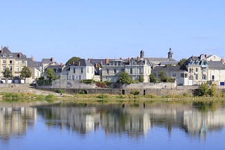
Content and Composition Ok so lets have a look at the content and composition of this image. I love the stretch of the buildings across the canvas, it really is screaming out PANORAMIC, so first lets have a look at a tight crop. 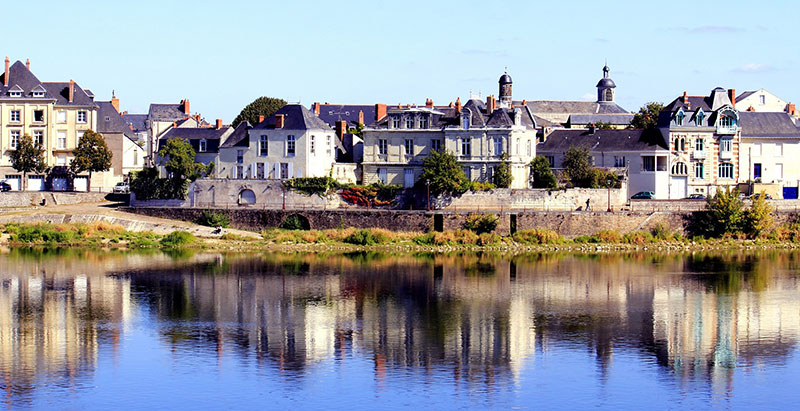
Cropped to a Panoramic shape
I do like this crop, it immediately strengthens the focal point or the point of interest in the image. We can afford to have less sky as it is clear, if there were amazing clouds that day then we could include more sky. There are also some great lines in this image, can you see them ?? They are not Leading Lines but Lines that dictate shape and form .... more clues ?? they are formed by a repetition of one of the elements in the image. When you are setting up a composition, if you can recognize these Lines then you can use them in a very subtle way to create very powerful images and the viewer will never pick up on what you have actually done but the composition will WORK. The Element in this image that I am talking about here is the chimneys of the buildings. Their colour makes them stand out and I am seeing two very strong lines 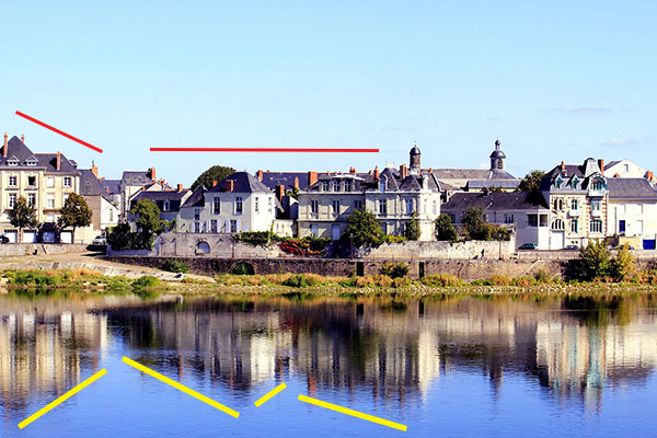
Look for compositional Elements that create Lines
There are more Lines in this image but lets just explore these ones. You will see that they are repeated [in a way] in the reflection. I really find the first two yellow lines very strong as they are creating a triangle shape, so here is a crop that I am visually seeing from that one Element [ or shape] 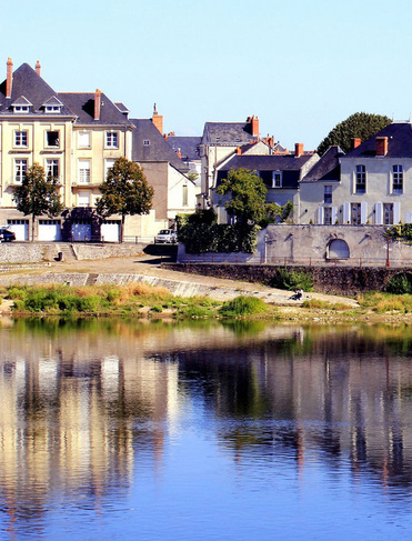
Wow this is amazing as I am now seeing so many things that I didn't see in the bigger picture. Firstly the triangle shape in the reflection is forming a V that leads our eye into the picture, this works very subconsciously but it does direct us into the picture. I am also now seeing a lot of repetition of shapes, can you see them ?? Any form of repetition always works in an image. I am not going to point them out but have a look for them yourself. Lets have a look at the right hand side of the image and see if there is a strong picture in there somewhere. 
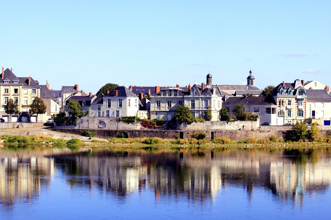
Click to enlarge and see what you can find on the other side of the image
Not as much on the right hand side, but there are some definite lines that I am seeing. Again there is a strong triangle shape in the reflection that we may be able to use in a crop. The two big turrets are an obvious one and a bit of a focal point and I am thinking maybe the V in the reflection may lead our eye to them. 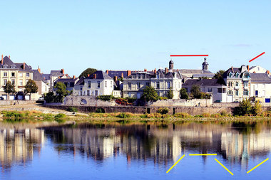
Lines, lines lines...
A crop of the right hand side
Can I just add that in no way am I saying that these cropped versions are better than the original, it is simply an exercise to point out how and what I look for in a scene when composing an image. And hopefully this will help you with your own compositions. Conclusion
Well thank you Susan for sharing this image with us, have a play with the crop tool and maybe start a fresh edit to see if you like the original sky colour. I am sure there is a couple more images in there also. It was certainly a great image to explore subtle lines and how they can influence an image. Cheers and thanks Click HERE to see more of Susan's work
5 Comments
20/3/2013 10:19:08 am
Thank you so much for this awesome critique. I have learnt a lot from your comments and I will definitely look at cropping some more. I have still hundreds and hundreds of photos from the same trip to process and I will be looking at them in a different way after reading this critique. You have helped me heaps and I am very appreciative of you sharing your knowledge.
Dean Cooper
20/3/2013 10:26:26 am
A pleasure Susan, glad you got something out of it, good luck looking all the other images, I am sure there are plenty of winners in there.
Anne Buckley
20/3/2013 10:08:25 pm
Very informative critique. Thanks Dean, and thanks Susan for sharing your image.
Dean Cooper
21/3/2013 09:00:14 am
Thanks for the comment Anne.
Angela
21/3/2013 09:51:18 pm
Another very thought provoking critique Dean. Your comment will be posted after it is approved.
Leave a Reply. |

 RSS Feed