Image Critique #9
" I went down to the beach to take sunrise photos and was surprised and lucky to get the pink sunrise. I like the ripples on the sand that lead from the left hand corner out to sea. It was really hard to compose as it was dark, the pink light was changing fast as the sun rose. I'm not sure if there is too much foreground and not enough sky and I know the horizon is crooked. The image has no adjustments, the dots on the horizon are ships queuing up for entry to Port Kembla." Here is the Metadata I pulled from the image Olympus OMD E-M5 Mk2 Lens set to 9mm (18mm full frame) Aperture f13 Shutter 25 seconds ISO 100 OK so what we have here is an image straight out of camera and typically because of that this image is very flat. When I say that what I am referring to is that the contrast overall is very uniform. When this happens we don't have a lot of depth in the image, our eye is not lead to different parts of the scene. I address this by adding contrast selectively to specific areas of the image. The horizon is obviously not straight and I get what Belinda is saying that when it is dark it is hard to compose, here are a couple of tips to help you out there. 1. Use your inbuilt level if your camera has one to get the horizon straight, if not then you can buy a small spirit level that clips into the hot-shoe. The problem with correcting horizons later is that we then need to scale the image up, so if we have the perfect composition then by scaling up we will lose elements and change the whole composition. 2. A geared head or a 3 way head are great for correcting horizon without changing the other two planes, I love my geared head, it allows me to make small changes to the composition on the three different axis independently, pure bliss for landscape work. 3. When it is dark and you are trying to compose, use live view and over expose, you will be amazed at how bright you can get the scene allowing you to see your foreground etc. To over expose use Aperture mode and increase the Exposure Compensation or go to manual mode set the aperture and then slow down the speed till the screen image is nice and bright. In live view (on a Canon this is called exposure simulation, on a Nikon it is probably something confusing like Rotate Tall LOL ) some entry level cameras don't do this and not sure Belinda if your OMD does. If your camera doesn't do this then simply take a shot and review it, then make some changes, I use a Hoodman Loupe for reviewing my screen, one of the best gadgets I have. I have straightened the horizon and had a good look at the image, lots of amazing detail when zoomed in, it is definitely one of those images that needs to be big.
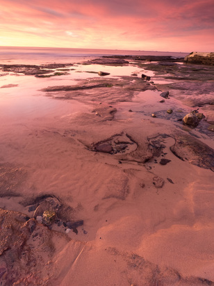
Before I edit lets talk about the composition. I am feeling way too much foreground here as it occupies about 80% of the image. Not that that is bad but to do that it needs to be a strong foreground that holds the viewer. There are some interesting shapes in the mid ground and I will crop below those to see if we can get this a bit stronger. Looking at this scene I would have walked up to the pool near the shoreline and shot from there., I'm also going to darken and lighten some areas of this image to give it some depth, I think it will make a big difference. 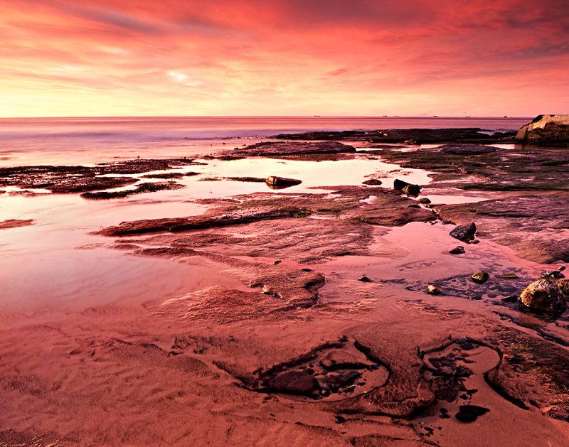 Final Image So here is the final image after some cropping and dodge and burn. To do this I make selections in Photoshop and then use levels or curves to darken/lighten or add contrast. I'm liking the foreground now, much simpler and with less of it we can enjoy the mid ground and that spectacular sky. Thanks for reading, analyzing and critiquing our images is a great way of learning so please feel free to share this post with your photo buddies. Thanks Belinda for sharing your image with us, great to see you up bright and early to catch that amazing light. Submitting Images for Critique These Image Critiques are free and I do one each month, to submit an image you need to be subscribed to my Free Newsletter. At the start of each month a Newsletter will go out inviting you to submit an image. Images are chosen at random, you can submit one image per month and if not chosen your image stays in the pool.
4 Comments
Helen
16/8/2016 07:21:41 pm
I think this is a great image without the major crop. While the image that Dean has produced with the crop is great, to me it is a different image from the one presented - it has a different feel. In the original image the large amount of foreground gives a sense of intimacy with the sand and the horizon is oh so far away. I agree that the horizon has to be levelled. My main issue in the image is with the colour. I find the pink looks almost like an overlay and while I have no doubt that the dawn was an amazing colour, the experience of its intensity in the image would be enhanced if you had desaturated at least part of the image (probably the foreground with a graduated mask gently fading up the image) so that the middle ground and horizon are stunningly pink compared with a more muted foreground where the texture provides the interest.
Dean Cooper
16/8/2016 08:23:05 pm
Hi Helen, thanks for your comments and views on Belinda's image. My crop has produced quite a different image to the original and part of the reason for cropping off the foreground is to teach people to see visually which parts of an image are strong and which are not adding to the image, de-staturating the foreground will change the tones in the image but I can't see it making the overall image stronger, I think less is more with this one. But I will drop it back into PS and do what you have suggested to see how it looks. Thanks again for your thoughts and vision, cheers Dean
Jill Heath
17/8/2016 03:37:37 pm
Hi Dean, I am really enjoying your critiques , as per usual your input is very thought provoking and above all educational!
Dean Cooper
17/8/2016 05:01:25 pm
Hi Jill, thanks for your comment it is great to see peoples views and ideas with this image. Your comment will be posted after it is approved.
Leave a Reply. |


 RSS Feed